No Custom Visuals Required
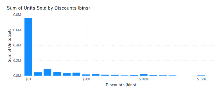
There’s a lot of conflicting, outdated advice out there on how to create a histogram in Power BI. Some blogs advise installed the now defunct Histogram visual from Microsoft. Others advocate creating your own bin category lookup table as a new data source. But buried deep in the Clustered Column Chart visual is an easier way.
Introducing Groups
Here’s how it works:
- Add a new Clustered Column Chart to your report in Power BI.
- Add your X-axis (categories) and Y-Axis (values) fields as normal to populate the chart.
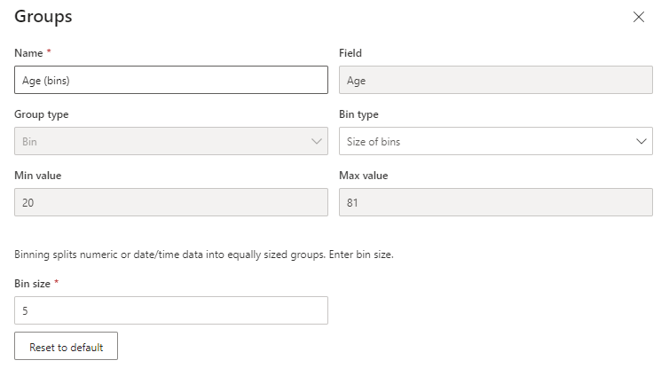
- Right click your X-axis field in the Build Visual screen to the right and select New Group
- Customize your histogram categories and sizes and click OK

Excel Shortcut of the Day: CONTROL + [
Also known as TRACE PRECEDENTS, using CONTROL + [ on a selected cell that has a formula will warp the user to the first cell reference in the formula. Try it out by typing =A1 in cell L13 and then hit CONTROL + [
It’s the fast way to investigate where the numbers in your spreadsheet are coming from.
